
Anyways, here are the 5 worst uniforms in the NFL:
 5. San Diahgo Whale Vaginas: Brand spanking new!!! Why? Seriously, why? The old ones were great. The navy blue tops were beautiful, and contrasted so nicely with the yellow and white lightning bolt. The road unis were awesome too, provided they wore the white socks with the navy stripes. Great all around. Now? Holy shit. Is it any wonder that LT is sucking wearing this garbage (don't get me started on the facemask either)? And seriously, when you have powder blue, use it.
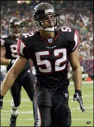 4. Atlanta Falcons: Just hideous. Awfully busy don't you think? Too angular and futuristic. Liked the black jerseys with white bottoms, but why 50 different combos of pants and tops? Seriously, who the fuck do you think you are? University of Oregon? Fuck off. They look fine on fast players like Vick (oops) but on Joey Harrington and Rod Coleman? Aggressive lines don't lend themselves well to fat fucks and white people.
 3. Arizona Cardinals: See Falcons. Why add a gray "throwback" facemask on a uniform that looks straight out of the Arena League?
 2. Minnesota Vikings: Here we go, the heavy hitters. Where to begin? Howabout we start with the basics, the colors. Purple, the color of royalty? Funny, because it looks like the color of shit. This Arean Leagues the fuck out of those other unis that think they're in the Arena League. The striping is just over the top awful. Just a trainwreck. They have some sweet helmets, but please, change the color scheme. It's not that purple can't be badass (see: Ravens, Baltimore) it's just that there are certian shades that look more badass than others especially when contrasted with other colors. The Ravens look tite because the black makes the purple seem agressive and the Ravens' crest makes the regality of the purple seem authentic. But the lighter purple that dominates the Vikings' unis is just too feminine. Would a Viking really wear purple like this? Fuck no. They'd be wearing blood and wine stained fur. Or at least something far less pussified.
  1. Cincinnati Bengals: Whooboy. Awful striping? Check. Too many combinations? Check. Retarded 'features' thrown in? Check. Looking bad on fat fucks and white people (i.e. the QB)? Check. Arena Leagueish? Triple Check. This is what we call domination people.
No comments:
Post a Comment