
Apparently the Browns are going to honor the 1946-49 AAFL dynasty that won four consecutive championships. My buddy who I work with is also a member of the Field Crew for the Browns and he dropped off some white helmet shells and the equipment manager for the Browns was just going to experiment with some color schemes, but apparently this is going to be official for some training camp or possibly a regular season game in this coming season.
The color scheme is going to be an all white helmet, a light gray facemask, the same striping style only two brown outside stripes and this time with an orange inside stripe down the middle of the helmet, and a brown player number on the side of the helmet. It sounds cool to me. I'm a big fan of white helmets and light gray facemasks, not to sound queer or anything.
The question Spencer asked me though is, what uniforms will they wear with them? I think all white would be pimpin. Though the browns really don't have many color combinations to choose from, but all white seems to be the best fit. It would be an especially nice fit, beacuse in the picture I linked to above as them in all white uni's there. So just to be consistent, we'll say white.
[Uni Watch]
Showing posts with label Uniform. Show all posts
Showing posts with label Uniform. Show all posts
Tuesday, March 25, 2008
Wednesday, December 19, 2007
Browns Fans: SIGN THIS PETITION
Sign this...
How in the FUCK could anyone even consider changing the Browns' uniforms? Give me a fucking break. The one bastion of tradition remaining in the NFL, and there's actual consideration being given to CHANGING IT????
You either love or hate the Browns' unis, it's a fact of life. But they're still an indentifying characteristic of the organization. Face it, as indentifiable as the Cowboys' star is, or the Raiders' crest, or the Dolphins' Coke-bottle dolphin with the mismatched helmet logo is, the Browns' lack of ANY logo is what fans identify the team with. You mention the Browns to anyone and the first thing they would most likely mention is the lack of a helmet logo and the traditional uniforms.
Please, PLEASE, stick with tradition, keep the uniforms sacred, as a part of the team's history, I beg of you.
Tuesday, December 18, 2007
Well, Those Were Cooler Than I Thought They'd Be

Just as I get done screaming about how monochromatic uniforms look like shit, the Vikings roll out their purple pajamas...but, strangely, I liked them a shit-ton.
I hate the regular Vikings uniforms, especially the purple pants and white tops, I think they look like absolute shit. And I also hate purple. But those unis last night were a thing of beauty, they lined up, looked good on fat or thin, white or black. They're not the Browns, Colts or Cowboys throwbacks or even the Jaguars home unis, but they were a marked improvement over the crap they usually trot out.
Now, if only the Vikes would go from the alternating colors, to all white or all purple, maybe, just maybe, their awful uniform indiscretions will be forgiven. Now, if only the team didn't suck.
Friday, December 14, 2007
The Worst Uniforms in the HISTORY of Sport

"ha. they look li ke used tampons."
This email from co-conspirator AC really nails it. What more is there to say? These are the worst uniforms I have ever seen.
The monochromatic trend is apalling, in my eyes at least. There is no need for it, and it makes teams look like shit. Sure, sometimes it looks good on athletic players, but those fat linemen look like the Kool-Aid guy...which now that I think about it, isn't that bad. Anyways, this trend needs to stop. Teams look like shit when they're wearing what appears to be a giant leotard.
Now, there are a few exceptions to the rule, obviously all white being the main one. Some of the all black teams can get away with it, I particularly like the Ravens' version. But when you're going with the "futuristic" monochromaticism and using traditional ornaments, like the Saints and Texans, you just get shit.
I'm glad that the Texans had the foresight to realize that nobody will see this game, so might as well dress the team like vaginal excretions.
Oh, and from the highlights...Mario Williams, we all owe you one massive apology. Continue the good work.
Tuesday, October 2, 2007
The Worst Uniforms in Sports pt. 2a: MLB
Once again I write with a beef. How can you include the Indian's away uniforms based on the fact that they are boring? These are far more boring. Two whole colors are real exciting San Diego. And what color is that anyway? It seriously looks like a shade of puke. It looks like someone ate some old ice cream and vomited it right back up, then slapped that color into some fabric and gave it to the Padres. Yuck. Why not just wear white or gray? That color is like an off white, gray, beige, poo colored piece of ba-dussey. Ok I'm done for now.


Monday, October 1, 2007
The Worst Uniforms in Sports pt.3a: NBA
I am shocked and appalled, stuptified and mortified; it's outrageous, egregious, proposterous! How the hell can you fail to include the Washington Wizards into the list of worst uniforms? Are you serious? They have the worst uniforms in all of sports. I mean it was bad enough that you included the Cleveland Indians in the baseball one. This Wizards uni's are the worst ever, period. Thats all I have to say about that.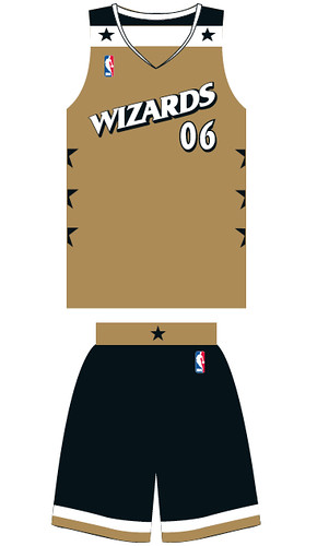
Friday, September 28, 2007
The Worst Uniforms in Sports pt.3: NBA
Basketball is in a different world than either football or baseball. Basketball has, for the last few decades, been about style. The individual nature of the sport lends well to oppurtunities off the court and the basketball jersey has long been part of the urban fashion world. That said, there are a TON of shitty basketball uniforms. I could go back, but for the sake of posterity, I'll only comment on the current slate of unis.

 4. Miami Heat: I hate everything about the Heat. I hate D-Wade, I'm sick of Shaq, I hate Pat Riley, I hate Udonis fucking Haslem. I hate them. I hate their "really original" white-outs. I hate their uniforms. Black, red, who gives a shit. They all suck. They just look queer. Especailly on a fat fuck like Shaq.

 2. Houston Rockets: Oh dear fucking' God these look like a woman menstruated at high speeds on a blank canvas. These lines are just terrible. How could anyone like these things? Especially considering how great the older ones with the pinstripes looked. Look how fucking ridiculous that tall ass Chinaman (sorry, the proper nomenclature is Asian-American, but is he American? Isn't he just Chinese? So he'd be a Chinaman) looks. God damn these are awful, but not as awful as...

5. Atlanta Hawks: New for this year. I do not understand these. The old ones were pretty awful, but at least they stayed true to some sort of team tradition. Everyone associates the Hawks with 'Nique; red and yellow. And while they say they're going back to their roots, those roots have been eviscerated by the historical face of the franchise. There are very few NBA fans who remember when the St. Louis Hawks wore navy blue. Why bring it back?
4. Miami Heat: I hate everything about the Heat. I hate D-Wade, I'm sick of Shaq, I hate Pat Riley, I hate Udonis fucking Haslem. I hate them. I hate their "really original" white-outs. I hate their uniforms. Black, red, who gives a shit. They all suck. They just look queer. Especailly on a fat fuck like Shaq.3. Philadelphia 76ers: Dear Lord are these atrocious. They look so bland. Predominantly black uniforms don't seem to work in the NBA without contrasting stripes or any other colors. The blue alternates are just as bad, if not worse. Just a really lame effort. Interestingly enough, they closely mirror the GM abilities of Billy King. Boring, stupid and like no effort was involved.
2. Houston Rockets: Oh dear fucking' God these look like a woman menstruated at high speeds on a blank canvas. These lines are just terrible. How could anyone like these things? Especially considering how great the older ones with the pinstripes looked. Look how fucking ridiculous that tall ass Chinaman (sorry, the proper nomenclature is Asian-American, but is he American? Isn't he just Chinese? So he'd be a Chinaman) looks. God damn these are awful, but not as awful as...1. Utah Jazz: Utah. Jazz. These things go together like cocaine and police. Why keep the name Jazz if you're going to a place where there aren't any black people? This makes no sense whatsoever. Then they use the great colors of purple and sky blue and pair it with one of the most hideous fonts ever. Just a lame excuse. Boring. Terrible. Utah sucks. Carlos Boozer should die.
Monday, September 24, 2007
The Worst Uniforms in Sports pt. 2: MLB
Baseball is an American tradition. The storied histories of numerous franchises trace back to the turn of the 20th century and that respect for the past gives us aesthetic treasures such as the Yankees' pinstripes and Dodger blue. As beautiful as the game can be (see: home game Giants, San Francisco) it can also be horrendously ugly (see: home game Twins, Minnesota). So without further bullshit, here are the 5 worst uniforms in the Major Leagues. Honestly, it could have been a lot worse though (see: NCAA football).
 5. Cleveland Indians: This hurts, it really does. But when I was thinking of the worst uniforms in baseball, I went through each division and mentally pictured each team. I just had to inclue the Tribe. Their home whites are actually good looking when paired with the white top or the blue. As sweet as home cookin' is, the road gear is about as boring as it gets which is why they're on the list. Points off for the logo, its time for Chief Wahoo to go. This is an open call for new uniforms (they already have a new alternate that will replace the vested alternates).
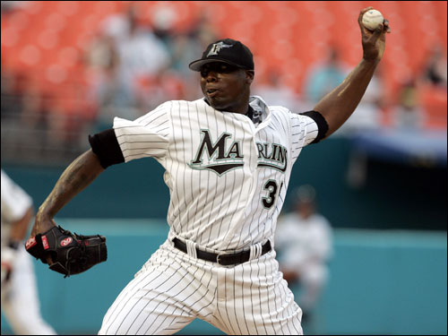 4. Florida Marlins: They're so ugly, only 400 people show up to their home games. The uniforms are probably why. Teal is bad. Teal is worse when paired with vivid black pinstripes. An exercise in subtlety these are not. Coupled with the usually awful Marlins baseball (and the fact that they stole a World Series from me) you have a recipe for some good-ol' fashioned crappy baseball.
 3. Oakland Athletics: White shoes. Great for football and basketball. Terrible when paired with gray. The white shoes look so out of place, you wonder if Billy Beane really is gay or if he just packs fudge without a sense of style. Regardless, this is America, and in America we don't look like retards. And how does an elephant fit into this whole shennanigan?
 2. Colorado Rockies: I thought the Rockies would be more mountainy than this. God-damn John Denver is full of shit. On a more serious note, purple is not a good color to wear unless you're really really good (see: Lakers, Los Angeles) or really really tough (see: Ravens, Baltimore). The Rockies are pretty awful and pretty puss-egious. Bad combo.
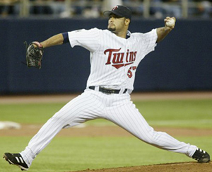 1. Minnesota Twins: Just boring and ugly. The font on the chest is just awful and outdated. The hats, well, there are a lot of 'em. This ranking isn't just about the uniforms themselves though, you have to factor in the hideous arena which makes the unis look even worse. Stay classy, Minnesota.
5. Cleveland Indians: This hurts, it really does. But when I was thinking of the worst uniforms in baseball, I went through each division and mentally pictured each team. I just had to inclue the Tribe. Their home whites are actually good looking when paired with the white top or the blue. As sweet as home cookin' is, the road gear is about as boring as it gets which is why they're on the list. Points off for the logo, its time for Chief Wahoo to go. This is an open call for new uniforms (they already have a new alternate that will replace the vested alternates). 4. Florida Marlins: They're so ugly, only 400 people show up to their home games. The uniforms are probably why. Teal is bad. Teal is worse when paired with vivid black pinstripes. An exercise in subtlety these are not. Coupled with the usually awful Marlins baseball (and the fact that they stole a World Series from me) you have a recipe for some good-ol' fashioned crappy baseball.3. Oakland Athletics: White shoes. Great for football and basketball. Terrible when paired with gray. The white shoes look so out of place, you wonder if Billy Beane really is gay or if he just packs fudge without a sense of style. Regardless, this is America, and in America we don't look like retards. And how does an elephant fit into this whole shennanigan?2. Colorado Rockies: I thought the Rockies would be more mountainy than this. God-damn John Denver is full of shit. On a more serious note, purple is not a good color to wear unless you're really really good (see: Lakers, Los Angeles) or really really tough (see: Ravens, Baltimore). The Rockies are pretty awful and pretty puss-egious. Bad combo.1. Minnesota Twins: Just boring and ugly. The font on the chest is just awful and outdated. The hats, well, there are a lot of 'em. This ranking isn't just about the uniforms themselves though, you have to factor in the hideous arena which makes the unis look even worse. Stay classy, Minnesota.Friday, September 21, 2007
The Worst Uniforms in Sports pt. 1: NFL
It's football season and the NFL is king. Since I'm sitting here bored off my ace and can't think of anything worthwile to do, I decided to do this. Aesthetics are an important part of the game and can characterize your team. For example, the Penn State Nittany Lions are known for their simple uniforms and, despite what they try to do, remain a traditional power-run/defense football team. The traditional uniform reflects the traditional game-plan. Now take Florida's garish blue and orange. Flashy colors, flashy playing style.
Anyways, here are the 5 worst uniforms in the NFL:
 5. San Diahgo Whale Vaginas: Brand spanking new!!! Why? Seriously, why? The old ones were great. The navy blue tops were beautiful, and contrasted so nicely with the yellow and white lightning bolt. The road unis were awesome too, provided they wore the white socks with the navy stripes. Great all around. Now? Holy shit. Is it any wonder that LT is sucking wearing this garbage (don't get me started on the facemask either)? And seriously, when you have powder blue, use it.
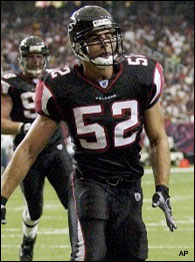 4. Atlanta Falcons: Just hideous. Awfully busy don't you think? Too angular and futuristic. Liked the black jerseys with white bottoms, but why 50 different combos of pants and tops? Seriously, who the fuck do you think you are? University of Oregon? Fuck off. They look fine on fast players like Vick (oops) but on Joey Harrington and Rod Coleman? Aggressive lines don't lend themselves well to fat fucks and white people.
 3. Arizona Cardinals: See Falcons. Why add a gray "throwback" facemask on a uniform that looks straight out of the Arena League?
 2. Minnesota Vikings: Here we go, the heavy hitters. Where to begin? Howabout we start with the basics, the colors. Purple, the color of royalty? Funny, because it looks like the color of shit. This Arean Leagues the fuck out of those other unis that think they're in the Arena League. The striping is just over the top awful. Just a trainwreck. They have some sweet helmets, but please, change the color scheme. It's not that purple can't be badass (see: Ravens, Baltimore) it's just that there are certian shades that look more badass than others especially when contrasted with other colors. The Ravens look tite because the black makes the purple seem agressive and the Ravens' crest makes the regality of the purple seem authentic. But the lighter purple that dominates the Vikings' unis is just too feminine. Would a Viking really wear purple like this? Fuck no. They'd be wearing blood and wine stained fur. Or at least something far less pussified.
 1. Cincinnati Bengals: Whooboy. Awful striping? Check. Too many combinations? Check. Retarded 'features' thrown in? Check. Looking bad on fat fucks and white people (i.e. the QB)? Check. Arena Leagueish? Triple Check. This is what we call domination people.
Anyways, here are the 5 worst uniforms in the NFL:
5. San Diahgo Whale Vaginas: Brand spanking new!!! Why? Seriously, why? The old ones were great. The navy blue tops were beautiful, and contrasted so nicely with the yellow and white lightning bolt. The road unis were awesome too, provided they wore the white socks with the navy stripes. Great all around. Now? Holy shit. Is it any wonder that LT is sucking wearing this garbage (don't get me started on the facemask either)? And seriously, when you have powder blue, use it.4. Atlanta Falcons: Just hideous. Awfully busy don't you think? Too angular and futuristic. Liked the black jerseys with white bottoms, but why 50 different combos of pants and tops? Seriously, who the fuck do you think you are? University of Oregon? Fuck off. They look fine on fast players like Vick (oops) but on Joey Harrington and Rod Coleman? Aggressive lines don't lend themselves well to fat fucks and white people.3. Arizona Cardinals: See Falcons. Why add a gray "throwback" facemask on a uniform that looks straight out of the Arena League?2. Minnesota Vikings: Here we go, the heavy hitters. Where to begin? Howabout we start with the basics, the colors. Purple, the color of royalty? Funny, because it looks like the color of shit. This Arean Leagues the fuck out of those other unis that think they're in the Arena League. The striping is just over the top awful. Just a trainwreck. They have some sweet helmets, but please, change the color scheme. It's not that purple can't be badass (see: Ravens, Baltimore) it's just that there are certian shades that look more badass than others especially when contrasted with other colors. The Ravens look tite because the black makes the purple seem agressive and the Ravens' crest makes the regality of the purple seem authentic. But the lighter purple that dominates the Vikings' unis is just too feminine. Would a Viking really wear purple like this? Fuck no. They'd be wearing blood and wine stained fur. Or at least something far less pussified. 1. Cincinnati Bengals: Whooboy. Awful striping? Check. Too many combinations? Check. Retarded 'features' thrown in? Check. Looking bad on fat fucks and white people (i.e. the QB)? Check. Arena Leagueish? Triple Check. This is what we call domination people.
Subscribe to:
Posts (Atom)
