Baseball is an American tradition. The storied histories of numerous franchises trace back to the turn of the 20th century and that respect for the past gives us aesthetic treasures such as the Yankees' pinstripes and Dodger blue. As beautiful as the game can be (see: home game Giants, San Francisco) it can also be horrendously ugly (see: home game Twins, Minnesota). So without further bullshit, here are the 5 worst uniforms in the Major Leagues. Honestly, it could have been a lot worse though (see: NCAA football).

5.
Cleveland Indians: This hurts, it really does. But when I was thinking of the worst uniforms in baseball, I went through each division and mentally pictured each team. I just had to inclue the Tribe. Their home whites are actually good looking when paired with the white top or the blue. As sweet as home cookin' is, the road gear is about as boring as it gets which is why they're on the list. Points off for the logo, its time for Chief Wahoo to go. This is an open call for new uniforms (they already have a new alternate that will replace the vested alternates).
4.
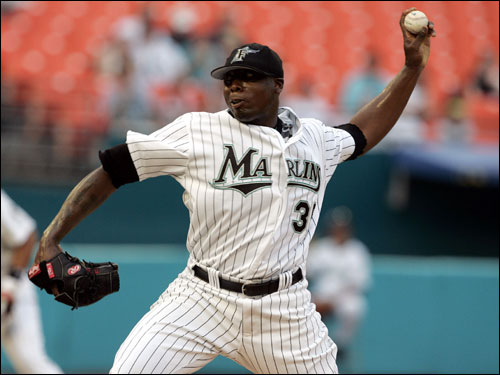
Florida Marlins: They're so ugly, only 400 people show up to their home games. The uniforms are probably why. Teal is bad. Teal is worse when paired with vivid black pinstripes. An exercise in subtlety these are not. Coupled with the usually awful Marlins baseball (and the fact that they stole a World Series from me) you have a recipe for some good-ol' fashioned crappy baseball.

3.
Oakland Athletics: White shoes. Great for football and basketball. Terrible when paired with gray. The white shoes look so out of place, you wonder if Billy Beane really is gay or if he just packs fudge without a sense of style. Regardless, this is America, and in America we don't look like retards. And how does an elephant fit into this whole shennanigan?

2.
Colorado Rockies: I thought the Rockies would be more mountainy than this. God-damn John Denver is full of shit. On a more serious note, purple is not a good color to wear unless you're really really good (see: Lakers, Los Angeles) or really really tough (see: Ravens, Baltimore). The Rockies are pretty awful and pretty puss-egious. Bad combo.
1.
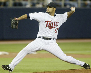
Minnesota Twins: Just boring and ugly. The font on the chest is just awful and outdated. The hats, well, there are a lot of 'em. This ranking isn't just about the uniforms themselves though, you have to factor in the hideous arena which makes the unis look even worse. Stay classy, Minnesota.


No comments:
Post a Comment